To ask whether interacting hubs are in the same pathway, we use the MIPS ontology, and compare the frequency of genetic interaction endpoints in the same pathway to the background frequency, considering the spectrum of hub-hub interactions from hub definitions of zero to 40. Here are the results:

Dip/Mips/SGA results (txt) /
Dip/Mips/SGA network
Old network results (txt) /
Old network
BIND/Mips/SGA results (txt) /
BIND/Mips/SGA network
Lee/Mips/SGA results (txt) /
Lee/Mips/SGA network
MIPS pathway ontology
(our parsed version, .txt)
Interpreting the analysis
In all charts: the red line denotes the percentage of
hub-hub genetic interactions whose endpoints are in the same
pathway; the yellow line denotes the percentage of all
possible hub-hub pairs for which both members of the pair are
in the same pathway. From left to right, we show the trend
as the criterion for a hub becomes more stringent.
In the top right chart, we show the analysis we performed in mid-2002. The red line is higher than the yellow line throughout, indicating that genetically interacting partners are more likely to be in the same pathway than two genes selected at random. There appears to be no positive trend to the red line, though, so we conclude that hubs are no more likely to be in the same pathway than any two endpoints of a genetic interaction. In fact, compared to the slightly positive trend in the yellow line, one might conclude that hub-hub genetic interactions are actually less likely to be in the same pathway than one would expect: genetic interactions as a whole are about 3 times likelier to be in the same pathway than a pair of genes at random; genetically interacting hub-hub pairs (with a hub definition of 40) are less than 2 times likelier than hub-hub pairs at random. There is a lack of data in this region, though, and the conclusion is speculative at best.
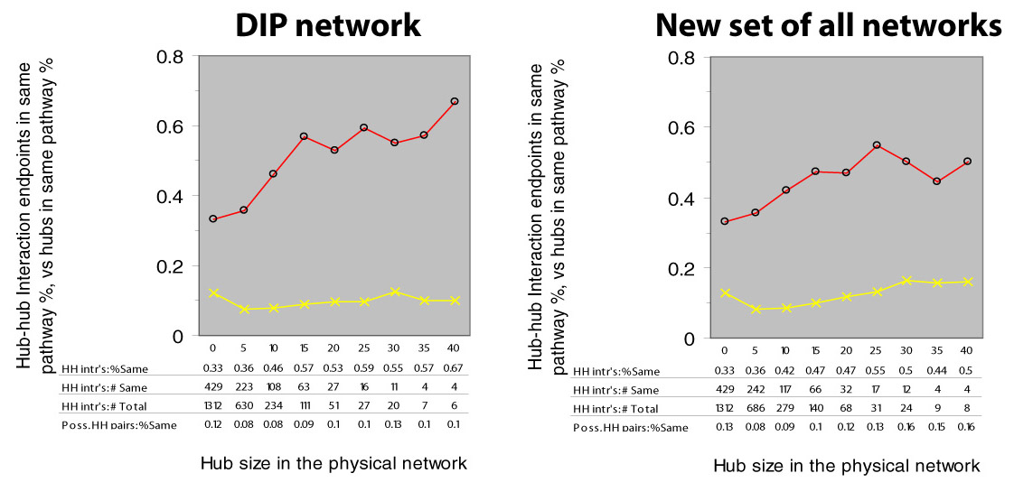
When we perform the same analysis using only the latest DIP data (April 2003), we see a different trend (in the upper left of the figure above): hub-hub interactions are decidedly more likely to be in the same pathway.
When we perform the same analysis using only the transcriptional data or BIND data (lower left and lower right panels of the above figure), the data are clearly too sparse to conclude anything.
When we combine BIND, DIP, and the Lee et al. transcription data, and perform the same analysis, we get the result shown below right, as compared to using only DIP (below left, copied from the above figure, top left panel):
BIND/Lee/DIP/Mips/SGA results (txt) /
BIND/Lee/DIP/Mips/SGA network
The increasing trend in the red line is no longer as strong, and there is now an increasing trend in the yellow line as well. Below, we plot the same two figures, but we include a new purple line to indicate the ratio between the percent of interacting hubs in the same pathway and the percent of randomly chosen hubs in the same pathway:
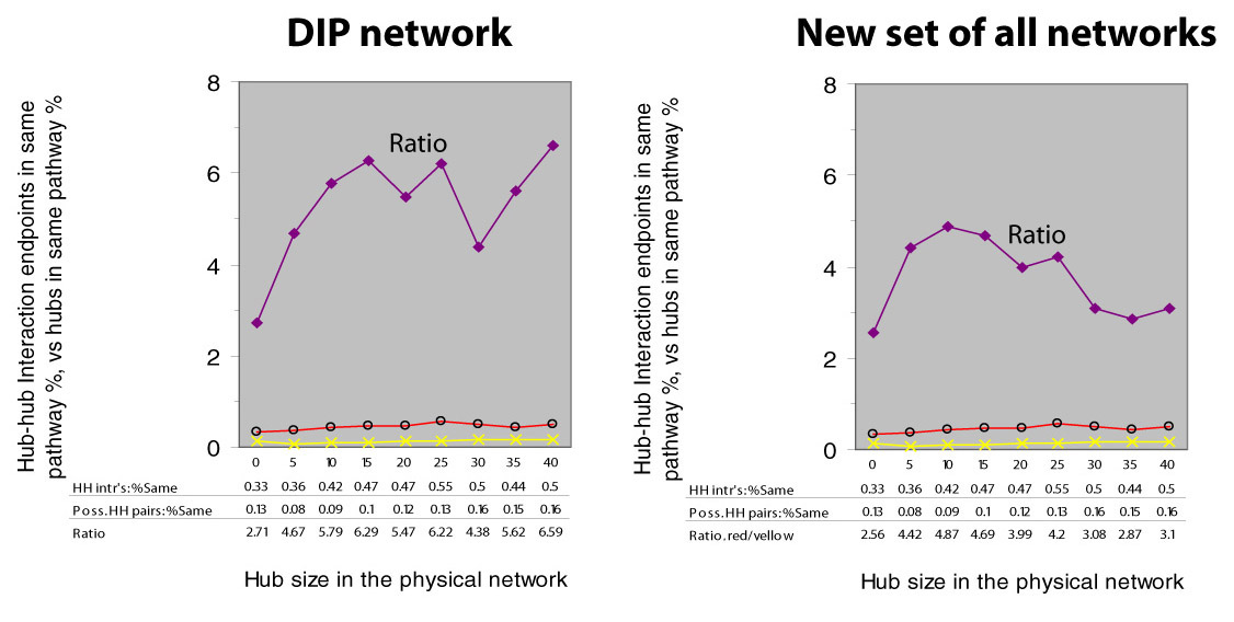
We are left uncertain of whether hub-hub genetic interactions truly tend to have a higher or lower percentage of endpoints in the same pathway. In either case, the trend is insignificant because of lack of data in the later hub cutoffs.